November 1st, 2020
Patch Internship, August - December

As the digital leader of hyperlocal news, Patch delivers everything local from news to events to neighbor posts. My role, as a Product Design Intern at Patch, has been to collaborate with two Product Managers, two Software Developers, and one Product Designer, primarily focusing on the responsive web design of Patch’s Core Product features. I used Figma, Hotjar, and Delighted to make design decisions and execute design solutions.
The Challenge
How might we build and maintain diverse communities via digital hyperlocal news delivery?
The Situation
As mainstream media mourns the downfall of local news, Patch continues to improve upon a newsroom product that centers diverse human experience. At Patch, every design task starts with a problem statement validated by user research. As a design team, we perform user research through various methods, including but not limited to surveys, use cases, heatmap analysis (first click testing), and user interviews. After analyzing this user feedback, we rapidly ideate design solutions within the scope of business requirements, technical constraints, and design considerations. A particular design consideration is that our target audience is generally older, ranging upwards from 45 years old, which requires more attention to sizing, contrast, and captioning.
The Problem
How might we identify critical user pain points to prioritize design team efforts and tasks?
The Task
Before my arrival, the design team identified broader themes from recurring feedback to properly prioritize and diagnose problem statements into a comprehensible affinity map, pictured below.
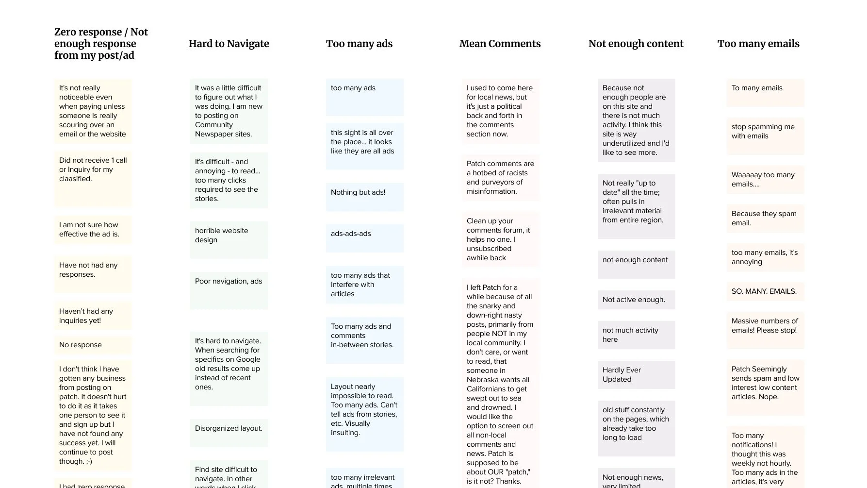
Out of the six most frequent user problems identified, my work focused on the following:
I get too many emails from Patch.
Task: Investigate user behavior on the email subscription page and make design recommendations
I didn’t get enough leads from my post/ad.
Task: Analyze user interviews and re-design the newly launched feature, business posts
The site is hard to navigate.
Task: Consolidate existing site structure and features into a lean, easy-to-understand design system that can support a unified newsfeed
The Ideation
How might we incrementally shift our existing designs and components towards the ultimate goal of a unified newsfeed?
The Task
Consolidate existing site structure and features into a lean, easy-to-understand design system that can support a unified newsfeed
The Action
We spent a lot of time imagining an ideal version of what it would be like if Patch built a sustainable design system that followed the principles of Brad Frost’s Atomic Design. The work, courtesy of my design teammate, is pictured below.

Notably, it does not cover everything (see: dropdown menus and desktop version) and that is when we started talking to Software Developers. In our weekly check-in with two Software Developers, we asked if the Development Team would be able to share their existing component library with us so that we could have a better understanding of what to add, remove, or edit to make our responsive web design more consistent. This has become increasingly more important as we look forward to “Phase 0” of Patch Everywhere, a unified local newsfeed for each town that isn’t cluttered by ads or user-generated content. Development agreed to assist us in our efforts and so came to be our Slack channel: #design-housekeeping.
We gathered design research from various sources including Dribbble, Medium, the New York Times, NewsBreak, and Facebook. The Product Managers handed over a basic mobile wireframe with design requirements.

I started with the article cards, experimenting with icon placement, font pairs, and font size. Should we have a topic tag? Would our users recognize a “More Options” menu? Which card should go first in the feed? How do I determine the content types that need a byline? Which designs would delight first-time users into visiting our site again? Could we convince the company to go forward with a three-column landing page desktop design?
Three words, three letters: Minimum Viable Product (MVP).
The Result
Over two weeks of daily, 30-min check-ins and a few hour-long meetings with Development, we understood that this design needed to meet the bare minimum requirements of a Patch-specific unified newsfeed. We would need to get there through incremental design changes, given the complexity of our back-end development. By the end of those two weeks, we were able to evolve the Patch Everywhere design from basic wireframe to MV-design system with the works: card types, menus, calls-to-action, icons, text, and MV-user flows organized with visual hierarchy and clear prioritization.
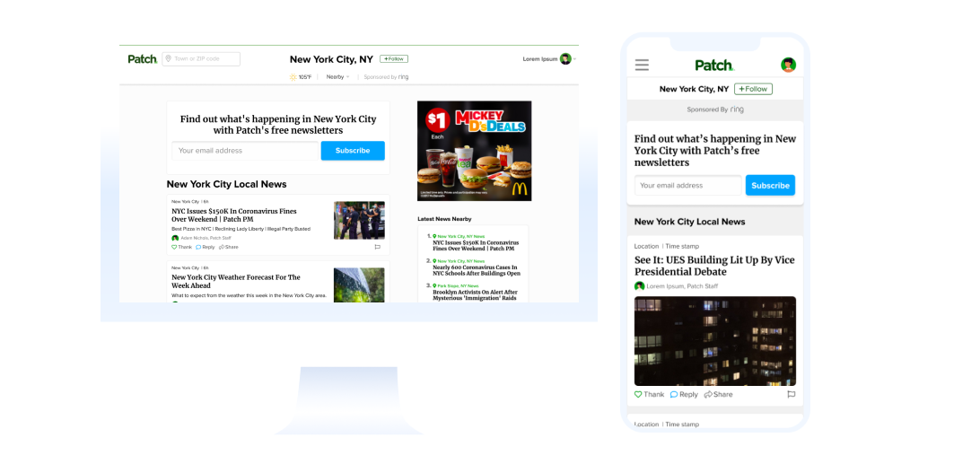

Mobile-version of five different content types: Weather forecast, Patch news, Instagram RSS, Local news, Press release, and Subscribe cards
The Conclusion
How might we measure success for design iterations?
As Patch continues to grow and iterate upon their product, design updates need to be prioritized in a sprint cycle. And this is the first priority! Patch hopes to move forward with this unified newsfeed design by 2021. We are incredibly excited for what this can mean for the future of Patch and until then, we’ll keep pushing to center the human experience in the digital hyperlocal newsroom.